Component properties
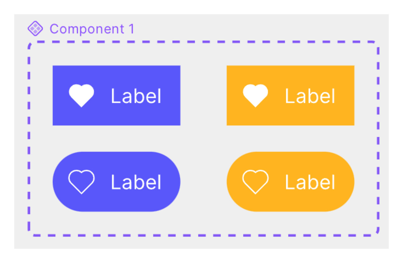
Component properties enables different variations of a component to be incorporated into a single component or component set.
Component property types
Component properties include the following types:
- Variant property
- Show / Hide property
- Text content property
- Instance swap property
- Slot property
Variant property
The variant property enables you to individually customize attributes for each variant within a component set. You can define attributes such as state, color, and size. Each variant property value is assigned to a specific variant.
Some aspects of a component can be tied to corresponding properties such as show / hide, text content, instance swap, or slot. These properties reduces the number of component variants that need to be created -- which means fewer operations, convenient management, and improved performance due to smaller file sizes.
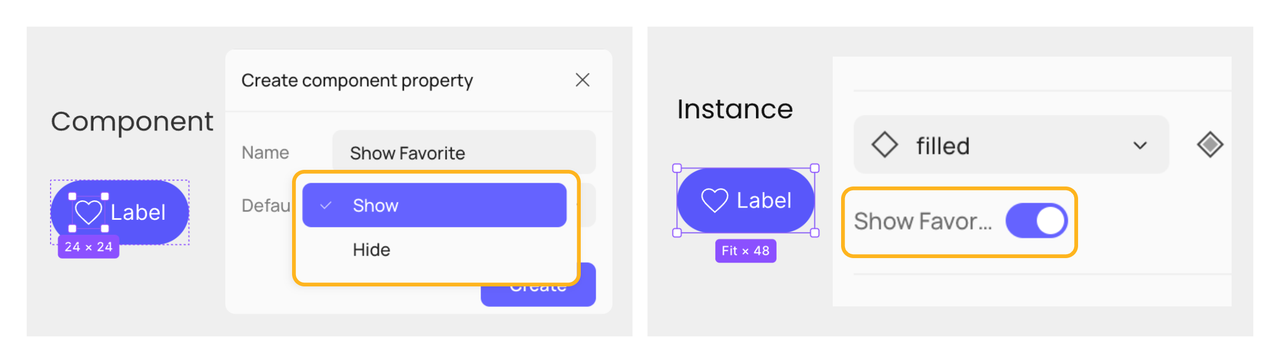
Show / Hide property
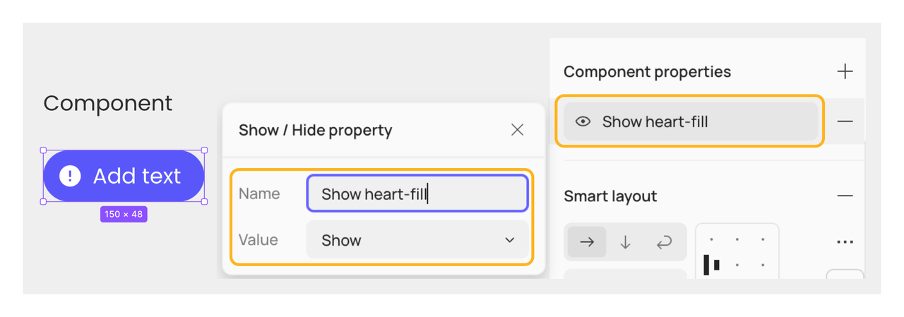
The show / hide property is a boolean attribute used to control the visibility of layers within a component. If a show / hide property is created for layer visibility, and its value is set to Hide, any associated layers will be hidden. Once changed to Show, the associated layers will be displayed.
Text content property
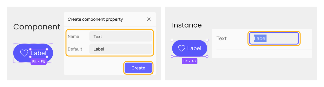
When applying text content property, you indicate which text layers are editable. Your collaborators can still modify text content not linked to this property in instances, but you might not recommend doing so. Default values for text content properties can be modified from the right sidebar or on the canvas and the modification will be synced automatically.
Note:The text content property dones not support rich text, including lists, superscripts, etc. The rich text you applied will not show in component properties panel.
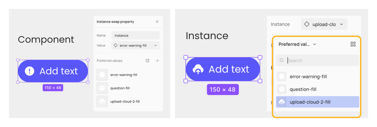
Instance swap property
The instance swap property identifies changeable instances nested in a component. Set instances from the current file or enabled libraries as default values. You can add preferred values to make it easy to find which icons can be swapped.
More tips about preferred values in part Preferred values of instance swap property.
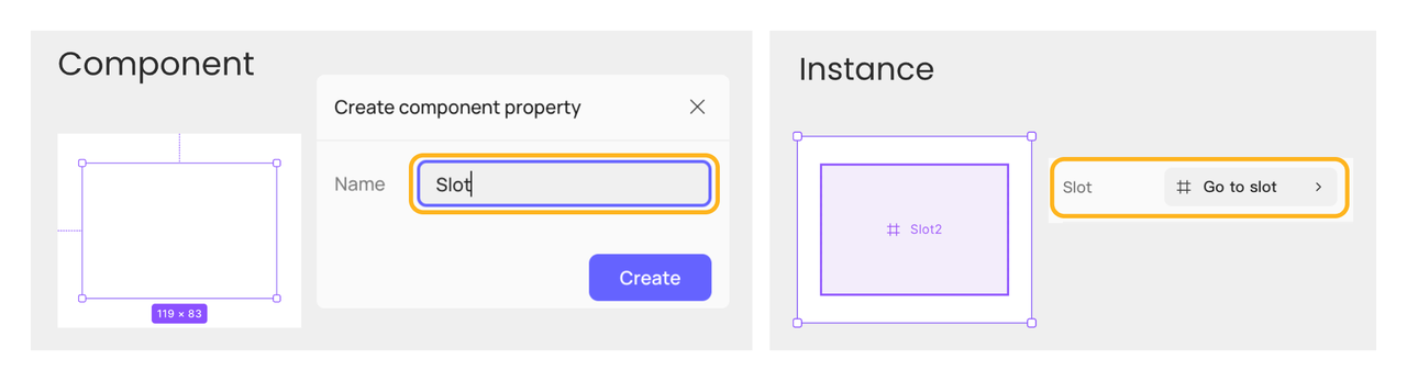
Slot property
Slots enhance component flexibility by designating an area as a slot, providing users with the space to tailor designs to specific needs. This allows design system creators to more effectively balance consistency and flexibility within their design systems. Additionally, you can define the layout properties of specific areas within a component, similar to the show / hide property and other properties.
More tips about the slot property in Use the slot property.
Create component properties
You can create component properties from two levels: the child layer of a component or component set (referred to as the child layer below) or the component or component set's own layer (referred to as the parent component below) .
Create from child layers
You can create show / hide, text content, instance swap, and slot properties from the child layers, and the properties will be linked to the specific layers without additional steps.
Steps:
- Select the child layer in a component or variant.
- Click the Link to component property icon in the section corresponding to the component property you want to create. If a dropdown menu appears, click Create new property.
- Name the current property and set the default value in the Create component property panel. Click Create.
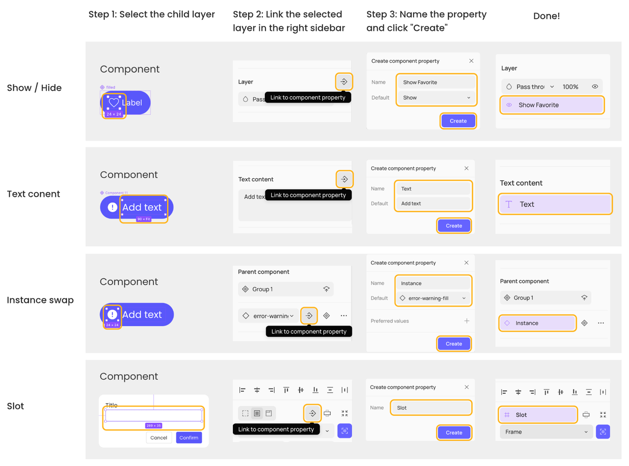
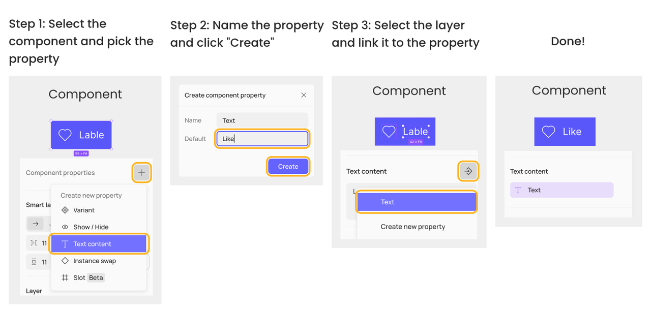
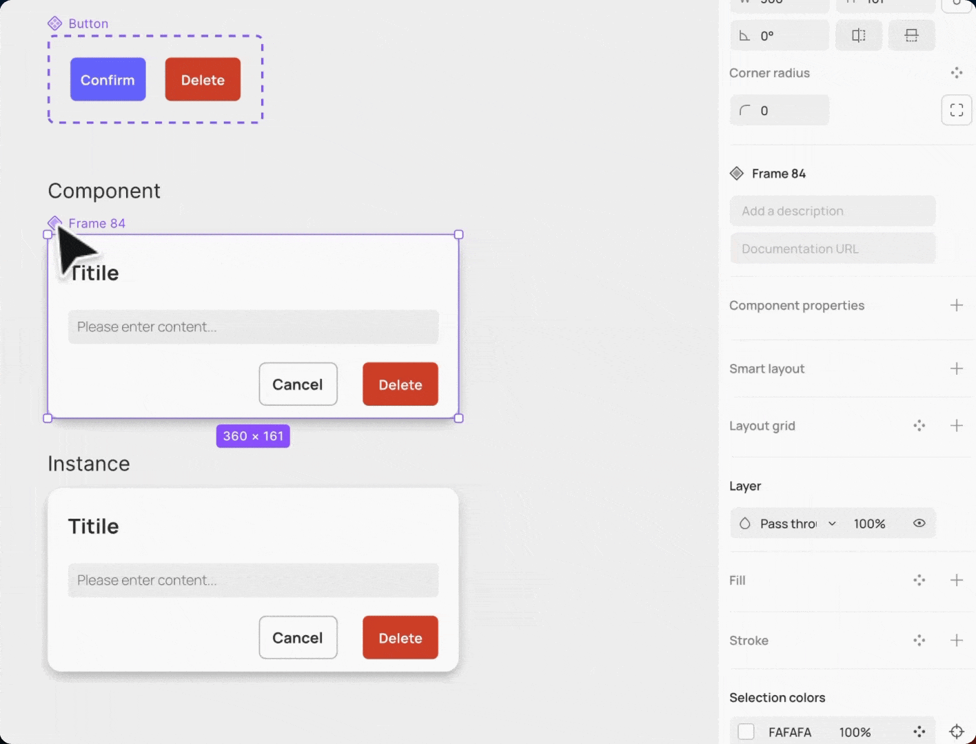
Create from the parent component
You can create all types of component properties from the parent component, but you need to link the child layers to the component property.
Steps :
- Select a component or component set, then access the properties section in the right sidebar. Pick the desired component property from the dropdown menu of options.
- Set your property name and default values. Click Create to create a new property.
- Select the layer for which you want to create properties. Click the Link to component property icon in the corresponding section of the component property you want to create. Select the property name you want to link from the dropdown menu.
Here's an example of creating the text content property from a parent component. Creating other properties follows a similar process.
Manage component properties
You can manage component properties by renaming, changing default values, detaching, deleting, reordering, and more.
Rename and change default values
Select the component set or component and click on the corresponding property in the right sidebar, you can rename all types of component properties and change the default values of show / hide, text content or instance swap properties. If the instances of the component have not applied property overrides, updating the default value will sync to the instances.
Note: The top-left variant in a component set is the default value of a variant property.
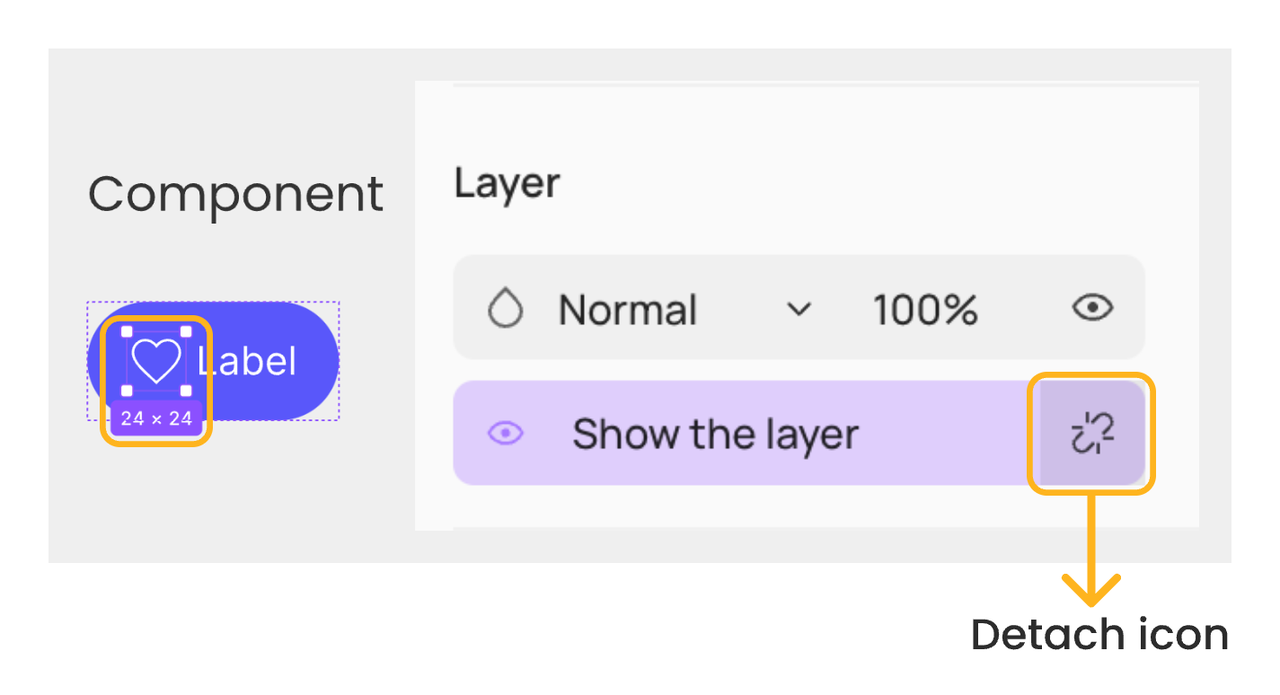
Detach properties
Select the child layer that is linked to a component property and click the Detach icon next to the property in the right sidebar, you can detach show / hide, text content, instance swap, or slot properties from the layer.
Note: This action will only detach the component property from the layer. The component property itself will not be deleted.
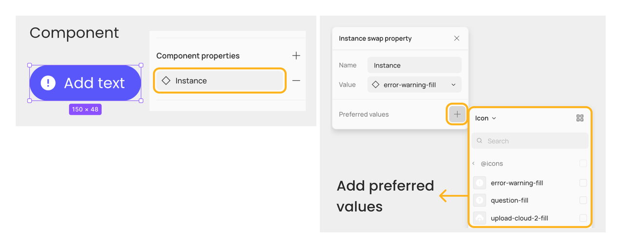
Preferred values of instance swap property
You can add a list of components as preferred values when creating or managing instance swap properties. This feature helps you identify recommended replacements for the nested instance and easily select the one you would like to swap to.
To add a preferred value for instance swap properties:
- Select the component set or component and click on the instance swap property in the right sidebar
- Click the + icon next to Preferred values
- Browse or search to find the component you want to add as a preferred value, and click to check it
To remove a component from the preferred values list, you can click the - icon on the right side of the preferred values list. This won't delete the component itself.
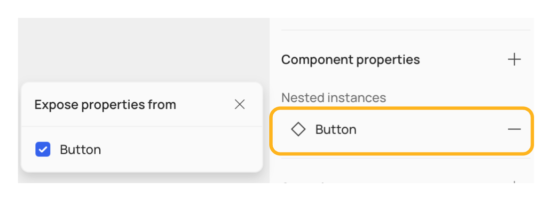
Expose nested instance properties
When an instance is nested in a top-level instance, you have to select the nested instance layer to change its displayed properties. With Expose nested instance properties, you can select the top-level instance and change properties of the nested instance directly.
Steps:
- Select the component set or component
- Click the + icon to the right of Component properties
- Click Nested instances in the dropdown menu and check the checkbox of the nested instance you want to reveal in the right sidebar
A list of the exposed nested instances will be displayed in the right sidebar. You can click the - icon to remove them from being exposed.
👍🏻 Helpful or 👎🏻 Not Helpful
👉🏻 Was this article helpful to you? We look forward to your feedback.
👍🏻 Helpful
👎🏻 Not Helpful