Layout grid
Layout grid allows you to precisely control the position of layers and efficiently arrange and layout design content.
You can apply grid rows, grid columns, and grids in layout grid to any frame, including:
- The top-level frames
- Nested frames within the parent frame
You can use grid rows, grid columns, and grids at the same time on a single frame as needed.
Create layout grid
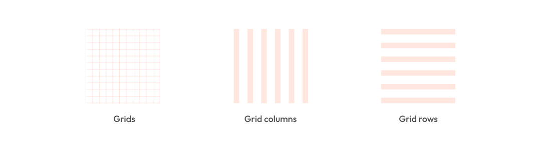
Layout grid come in three types: a uniform square Grid, Columns, and Rows.
Here are the steps to create them:
- Create a frame, click the + icon next to layout grid in the right sidebar, and an 8px-sized grid will be applied to the frame by default.
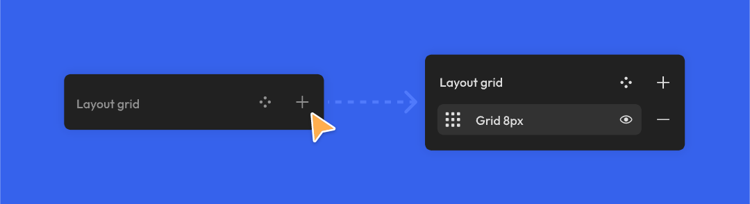
- Click the icon to the left of the grid, and a settings popup for the layout grid will appear. Click the dropdown box in the top left corner of the settings popup to switch between grids, columns, and rows.

Note: Layout grid are not exported when exporting slices, nor are they displayed during prototype playback.
Layout grid properties
Grid properties
You can define the following properties of your grid:
- Size: The default grid size is 8px, which means that each square has 8x8=64 pixels. You can manually input a value in the size box to modify the grid size.
- Color: Adjust the color of any layout grid in the color swatch.
You can also create multiple grids with different sizes and colors in the right sidebar to meet specific requirements.
Column and row properties
You can define the following properties of the columns and rows:
-
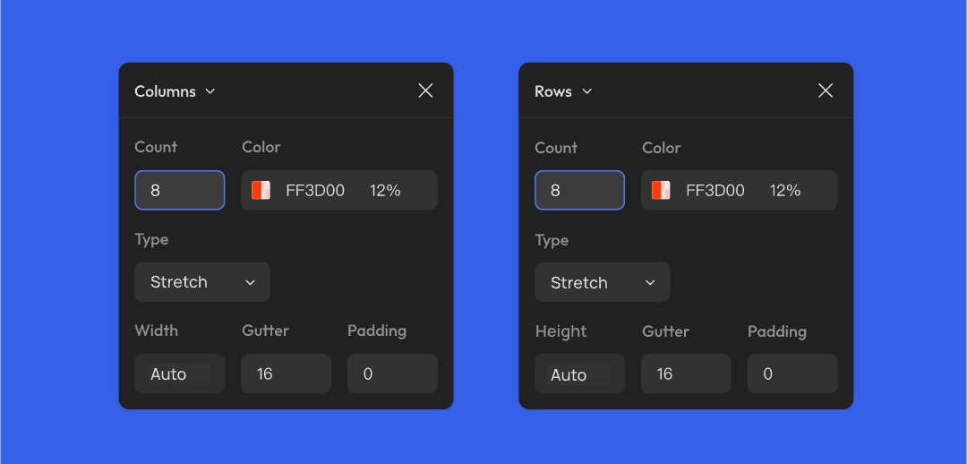
Count: The count of grid columns or rows, defaulting to 8. You can input a value manually. If you delete the number in the input box, the value will become (0) automatically.
-
Color: Set the color of the grid columns or rows.
-
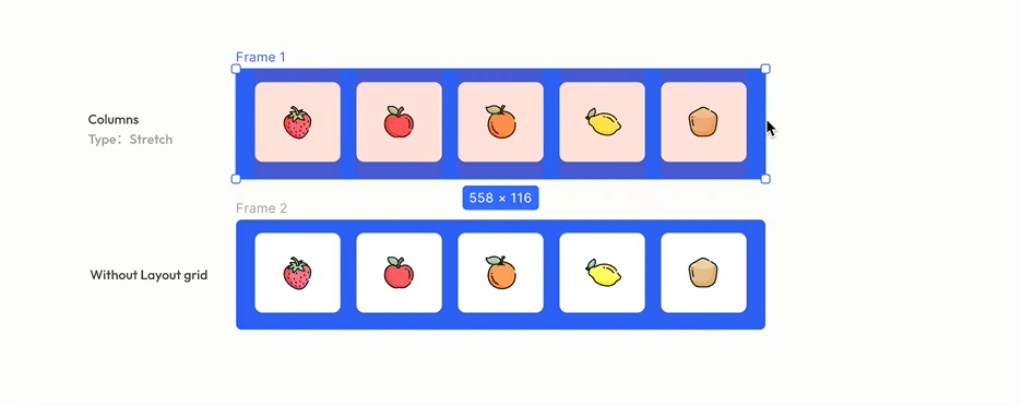
Type: Configure the layout mode of layout grid. It can be set to stretch (which makes the grids adapt to the size of the frame) or start from a certain side. The following table illustrates the layout modes and effects for grid rows and columns.
| Layout type | Layout effect | |
|---|---|---|
| Column | Left | Layout from left to right |
| Center | Layout from the center towards both sides | |
| Right | Layout from right to left | |
| Stretch (Default) | Automatically stretch with the frame's width, maintaining consistent margins on both sides | |
| Row | Top | Layout from top to bottom |
| Center | Layout from the center towards the top and bottom | |
| Bottom | Layout from bottom to top | |
| Stretch (Default) | Automatically stretch with the frame's height, maintaining consistent margins on both top and bottom |
- Column width or row height: Adjust the width of each column or height of each row. If the layout is set to Stretch, Creatie will automatically calculate the width or height.
- Gutter: The space between columns or rows.
- Offset: The left / right margin for the leftmost / rightmost column, or the top / bottom margin for the topmost / bottommost row.
- When the layout type is fixed to one side, the offset value is the margin between the grid and the frame on that side. For example, for a grid column fixed to the right side, with an offset of 8px, the margin between the grid column and the frame's right side is 8px.
- When the layout type is centered, offset cannot be set.
| Layout type | Offset effect | |
|---|---|---|
| Column | Left | Distance from the left side of the frame to the column |
| Center | N/A | |
| Right | Distance from the right side of the frame to the column | |
| Stretch (Default) | N/A | |
| Row | Top | Distance from the top of the frame to the row |
| Center | N/A | |
| Bottom | Distance from the bottom of the frame to the row | |
| Stretch (Default) | N/A |
- Padding: The padding can only be set when the layout type is stretch. You can set the padding between columns and the frame's left and right sides or between rows and the frame's top and bottom sides.
Layout grid style
You can create commonly used layout grids as styles for reuse. Like all other styles, you can upload them to the team library for other team members to use.
To create a layout grid style:
- Click the Style icon next to Layout grid to open the grid styles popup
- Click the + icon in the top right corner of the style popup, input information of the new style, and click Create

After creating all the grid styles, click the Style icon next to the layout grid and select the style you want to use in the grid styles list.

Toggle layout grid
Once you add layout grids to design content, the corresponding grid and column / row effects will be displayed on the canvas by default.
To toggle the visibility on all layout grides without deleting them:
- Click Layout grids in the dropdown menu of view options in the top right corner to toggle the layout grids off and on
- Use the keyboard shortcuts:
Shift+G
Note: This setting only applies to your account and does not affect your collaborators
To enable or disable a single layout grid, click the Eye icon next to the layout grid in the right sidebar to toggle the layout grid off and on.
Relationship between layout grid smart layout, and constraints
In a frame, layout grid cannot be used simultaneously with smart layout but can be used with constraints.
Combining layout grid with constraints allows for a more powerful and flexible responsive layout. For instance, in a frame with a layout grid, you can set constraints for layers within the frame, and these constraints will be applied to the nearest grid row or column.
👍🏻 Helpful or 👎🏻 Not Helpful
👉🏻 Was this article helpful to you? We look forward to your feedback.
👍🏻 Helpful
👎🏻 Not Helpful